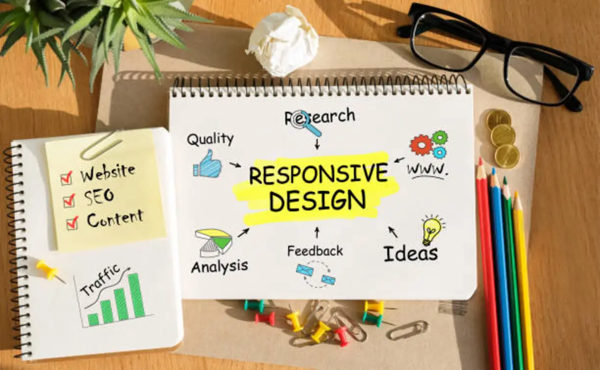
Your next customer is probably reading this on a phone. Maybe they found you through a Google search, a social post, or an AI-generated answer. If your website is hard to read or slow to load on their screen, they will leave in seconds and visit a competitor instead.
That is why responsive web design is no longer optional for small businesses in 2026. It is the foundation of how customers find, judge, and contact you online.
What Is Responsive Web Design?
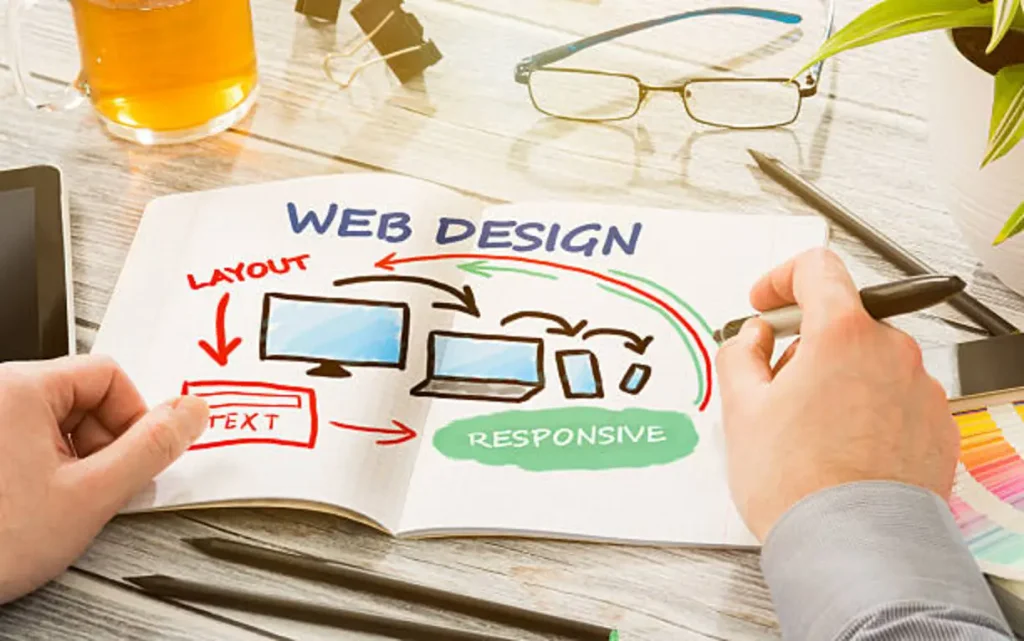
Responsive web design is an approach where a website automatically adjusts its layout, images, and text to fit any screen, whether a phone, tablet, laptop, or desktop. Instead of building separate sites for each device, you build one flexible site that works everywhere.
responsive design matters because most people browse on mobile, Google ranks mobile-friendly sites higher, and a site that adapts to every screen gives visitors a better experience and gives you more enquiries.
1. Your Customers Are Mobile-First
A large share of web traffic now comes from smartphones, especially for local searches like “salon near me” or “plumber open now.” Small businesses depend on exactly these quick, high-intent searches.
If your site forces visitors to pinch, zoom, or scroll sideways, they will not stay to figure it out. A responsive layout puts your phone number, services, and contact form right where a mobile visitor can use them.
2. Better Website User Experience Builds Trust
A good website user experience is about how easy and pleasant it is to get what you came for. On a responsive site, text is readable without zooming, buttons are easy to tap, and menus are simple to use on any device.
First impressions form fast. A clean, consistent experience tells visitors your business is professional and reliable. A broken or cramped layout suggests the opposite, even if your products and service are excellent.
3. Mobile Website Performance Affects Rankings and Sales
Mobile website performance covers how quickly your pages load and respond on a phone. Slow pages frustrate visitors and push them to leave before they see your offer.
Responsive design helps by serving appropriately sized images, using lightweight layouts, and avoiding the heavy, duplicated code that separate mobile sites often carry. Google also uses mobile-first indexing, meaning it mainly looks at the mobile version of your site when deciding where to rank it. A fast, mobile-friendly site gives you a clear advantage in search.
4. Website Usability Turns Visitors into Customers
Website usability is the difference between a visitor who browses and a visitor who books. Responsive sites make key actions simple on any screen:
- Tap-to-call buttons and click-to-map directions
- Short, easy-to-complete contact and booking forms
- Clear navigation that does not hide important pages
- Readable text with enough spacing and contrast
When every step feels easy, more visitors complete it. That means more calls, form submissions, and sales from the traffic you already have.
5. Responsive Design Supports SEO and AI Search
Search is changing. People now get answers from traditional results, featured snippets, voice assistants, and AI-powered search tools. All of them favour websites that are clear, fast, and well structured.
A responsive site supports this in several ways:
- One URL for all devices, so search engines do not have to compare duplicate versions
- Clean structure with proper headings, which helps both search engines and AI tools understand your content
- Lower bounce rates, because visitors stay when the page works for them
- Better voice and local search readiness, since many of those searches happen on phones
When your content answers real customer questions in a clear, scannable format, you are more likely to be picked for featured answers.
6. It Saves Money Over Time
Maintaining one responsive site is simpler and cheaper than managing separate desktop and mobile versions. Updates happen once and appear everywhere. For a small business with a limited budget, that means fewer maintenance costs and fewer errors.
Quick Responsive Design Checklist
Use this to check your current site:
- Open it on your phone. Is the text readable without zooming?
- Can you tap every button and link easily?
- Does the page load in a few seconds on mobile data?
- Do images resize without breaking the layout?
- Is your phone number and contact form easy to find?
- Does the site look consistent on a tablet and a large monitor?
If you answered “no” to more than one, your site is likely costing you customers.
What to Look for in Web Design Services for Small Business
- A mobile-first approach, not just a desktop design that shrinks down
- Focus on speed, usability, and clear calls to action
- SEO-friendly structure built in from the start
- Transparent pricing and honest timelines
- Ongoing support after launch
At Dextelite, we build responsive, search-friendly websites designed to help small businesses look professional and generate real enquiries on every device.